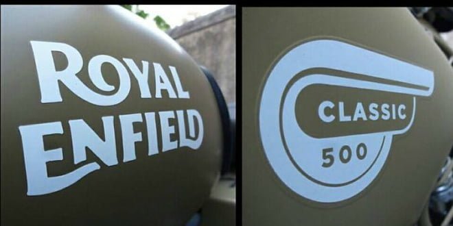
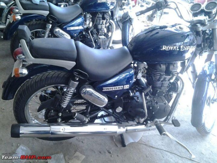
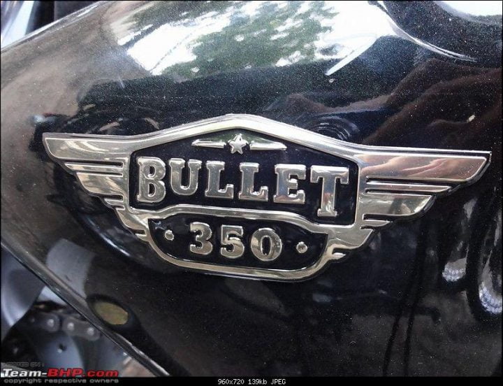
India’s marquee motorcylcle brand Royal Enfield has modified the brand logo and stickers. The official website states that the changes in the font and decals will give a fresher, more vibrant and contemporary appearance. We think that the move aims at popularising the bike amongst the youth. The company has already updated the logo on its official website and the change will be brought about in all the bikes. In addition to the brand logo and its font, even the crest, monogram and stripes have undergone a makeover. Though the company is trying to modernise its appeal and keep up with the 21st century, this change in the font and other graphics have received a lot of criticism from the fans. Check out the Royal Enfield logo and product sticker changes below:
The purists and aficionados believe that the new logo doesn’t have the royalty and grandeur like the previous one. And even the youth who prefers a Royal Enfield bike over a fancy sports bike, like it because of the legacy and the rich history associated with the brand, the logo being a big part of that legacy. People have also suggested Royal Enfield to make the changes to the newer breed like the Thunderbird and leave Classic and Continental GT for the sake of its vintage philosophy. Irrespective of the grouches, Royal Enfield won’t roll back the changes since they have started marketing the logos and the changes on their website. They have a dedicated webpage which showcases all the logo changes and even have an FAQ section about it. The logos are already being updated in the major cities and the change will take place phase wise pan-India.
We think that the fans will get used to the change and accept it eventually. Mechanically the bikes remains same with the usual set of BHPs and CCs. The keys have also received new looks with the changed company monogram on it which gives it a limited edition appearance.
The Chennai based company recently announced Rs. 6 Crore investment over the next 2 years to increase the production and R&D. The company should make judicious use of the same by allocating it for quality control rather than fixing something which is not broken ergo the logo.
Do let us know what you think of the new logo.
Pic Courtesy: team-BHP.com


