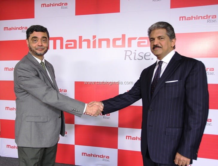
The new avatar of Mahindra has brought it again in the lime light. The launch of the new visual identity of Mahindra was done in Delhi on Jan18, 2013 at a press release by the top officials of the company.
Mahindra already has a good call in India and around the globe in all the industries it is present. Then why it thought for the re-launch of brand? The answer was given by Anand Mahindra, Chairman, Mahindra Group. While talking with the press he explained that the change has been done to reflect Mahindra’s zeal to continuously grow and innovate, and keep its success record intact.
In the past also Mahindra had done extensive marketing and branding to change its image from a manufacturer of farm vehicles to the manufacturer of fast city machines. But at this time when Mahindra is a well-established brand and rolling high revenues, such a retouch to its brand suggests that it doesn’t want to leave any stone unturned to keep the grip on its markets and further extension of the same. Competitors Beware!
The new word mark and logo are painted with vibrant red color. Word mark is bolder than the previous one. The fonts have very classy curves and ends that give a very youthful and energetic feel. The logo ‘Ridge’ is inspired by Mount Everest. The new visually identity gives a clear message on account of Mahindra that it plans to always rise high and keep everyone along.
It plans to use its new word mark and logo for all its companies and businesses across the globe. But the color of the logo will be changed on the basis of different businesses. Like all the commodities and mobility business will have complete red logo, red-grey color for B2B businesses and yellow, green, blue with red for B2C businesses. Looks like Mahindra is driving on top gear like all its machines.


